Data Dashboard Design Top Considerations

Designing and Building BI Dashboards: Leading Practices
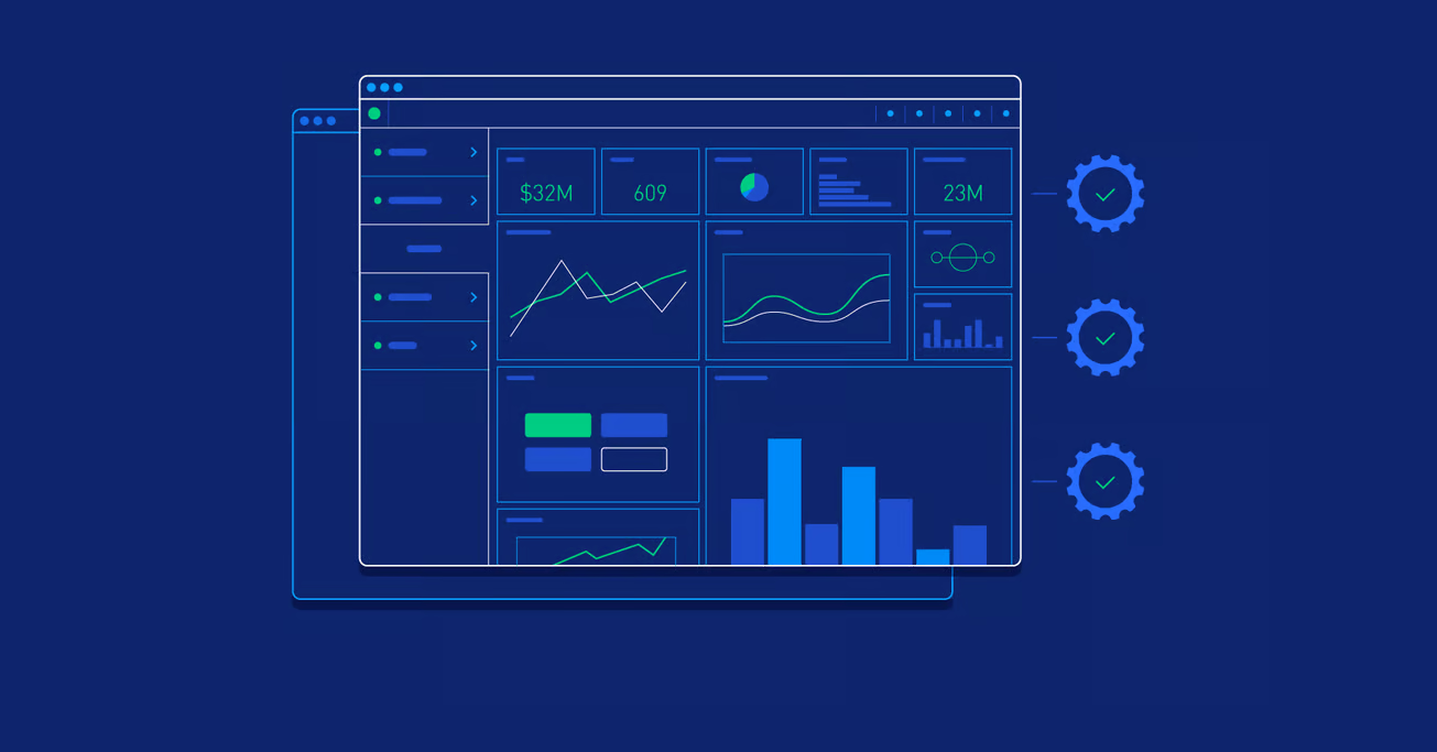
Business Intelligence (BI) dashboards enable companies to gain deeper insights into their data by presenting statistics in chart- and graph-based formats that are easy to understand. While data visualization is a core element, these dashboards also streamline reporting and communication. A well-organized dashboard will be simpler to interpret, helping users better grasp and act on the information it provides.
Below, we’ll outline best practices for designing a BI dashboard that is clean, concise, and visually appealing.
What Is a Business Intelligence (BI) Dashboard?
A BI dashboard is a visualization tool that presents key business metrics in one centralized location. By consolidating data from a variety of sources, it helps organizations monitor, track, and analyze essential performance indicators. Which metrics you track will depend on your organization’s specific objectives.
Why Build a BI Dashboard?
BI dashboards are incredibly useful for those monitoring critical metrics like sales performance, marketing initiatives, lead generation, and more. The best BI platforms make it possible for anyone to create a dashboard, even without deep expertise in data analytics or Excel.
Because dashboards display only the most current information in a single, user-friendly view, users can quickly spot trends and take action. Gone is the need to sift through separate tools or generate multiple reports—the relevant information is right there, ready to be explored.
What to Track in Your BI Dashboard
Each organization will have unique data requirements. Before building a dashboard, first clarify your business goals or the key question you’re trying to answer. That way, you’ll focus on gathering the metrics that truly matter rather than cluttering your dashboard with unnecessary figures.
BI Dashboard Best Practices
1. Know Your “Why”
Start by identifying your main objectives or challenges. Which data sources are crucial for finding the answers you need? Which metrics do you need to monitor closely to address your current business questions? By defining these requirements early, you can keep the dashboard focused, intuitive, and free of clutter.
2. Know Your Audience
Determine who will be using the dashboard and what their goals are. Ask:
- Who will interact with this dashboard?
- What objectives or metrics do they care about?
- How frequently will they consult the dashboard (daily, weekly, monthly)?
Tailor the design, data, and structure to your audience’s specific needs and cadence.
3. Determine Your Data Sources
Gather data from internal and external systems, but only the sources relevant to your dashboard’s goals. Adding unrelated data can create visual clutter and confusion. Also ensure that your sources provide accurate, high-quality data. Utilize data connectors or integrators to automate updates, ensuring real-time accuracy.
4. Work from the Top Down
To help new users quickly find essential information, place the most important metrics at the top—ideally in the upper-left corner. This “inverted pyramid” structure ensures critical data is immediately visible. Middle sections can offer supporting details, while the bottom or right side can handle background information or less critical data.
5. Make Your Charts Easy to Understand
Use consistent formatting, clear labels, and simple colors. Some key tips:
- Clearly label each section so users know what they’re viewing.
- Use size, color, and spacing to organize dashboard elements.
- Avoid visual clutter—less is often more.
- Keep the most important information in the upper left.
- Maintain consistent alignment and leverage white space to keep the interface balanced.
- Present an overview first, and allow users to drill down for deeper insights.
6. Consider Screen Sizes
Be mindful of how users will access the dashboard—on desktops, tablets, or smartphones. Limited screen space on mobile devices means you’ll need to prioritize which information appears first. Ensure buttons, filters, and interactive elements are easy to tap or click, and that everything scales for different screen sizes.
7. Allow Users to Interact
Offer training sessions so users can learn how to navigate the dashboard. Provide interactive filters, such as:
- Drill down: Display more granular data in a hierarchical view as needed.
- Drill through: Show pop-up windows with extra context or details.
- Click-to-filter: Filter the entire dashboard by clicking on a specific chart or metric.
These features keep the dashboard tidy while allowing users to explore information at their own pace.
8. Include Historical Data
Incorporating historical data helps users track trends over time. Make sure to label axes, columns, rows, and legends to provide context—this helps viewers understand whether metrics are moving in the right direction.
9. Enable White Labeling
Customization is key for many users. Let teams adapt the dashboard to match their brand or department, including fonts, colors, and logos. A consistent theme can make the dashboard feel more familiar and aligned with organizational branding.
Conclusion
A BI dashboard can be a powerful tool for collecting and communicating critical information. By leveraging best practices—focusing on your goals, understanding your audience, integrating the right data sources, and keeping the interface organized—you’ll create a dashboard that is both effective and easy to use.
Multiple tools are available for building such dashboards, from simple spreadsheets to advanced BI platforms. With a well-designed BI dashboard, your organization can make more informed decisions, improve collaboration, and respond to data in real time—ultimately driving better business outcomes.